Screen Grab 1:
This screen grab shows the opening shot of the film. As seen, in post-production, Jenna and I decided to start with action. This challenges conventions as it is typical for short films to start with the title of the film, and possibly some other titles such as names of the cast.
Screen Grab 2:
This screen grab is our main character 'Grace' running into her room. This challenges forms and conventions, as so far in the opening of the film, we know very little about the film so far. However, it also uses conventions, as we start with focus on our main character, which is typical for a short film.
Screen Grab 3:
This shot here uses forms and conventions, as the font and colouring is child-like, which is a trait of our main character. It is also minimalist, which is a theme throughout the film, which is typically connoted in the title with the name of the film.
Screen Grab 4:
This is the short after our title appears. Here we are still challenging conventions, as we have had very little dialogue so far, and the only dialogue we can hear currently is muffled, as Grace is in a daydream. However, we are still using forms and conventions as we are still focused on the main girl, and have currently not seen any other characters in the plot.
Screen Grab 5:
This shot uses forms and conventions, as it establishes the age group and situation Grace is in currently. The mise-en-scene and setting up a recognisable surrounding follows conventions of a short film. The dialogue is muffled in the background, this uses forms and conventions as it is and edit people would expect for someone who is in a daydream. However challenges codes and conventions as there has been little dialogue so far.
Screen Grab 6:
This shot develops forms and conventions, as it depicts the emptiness of Grace, however I believe it develops conventions as the shot is still on the opened door, as a whole scene. This is unusual, even though it uses the conventions of depicting the mood and feelings of the main character. The long shot helps to emphasise this, allowing the audience to relate to the feelings of Grace, in turn using and developing forms and conventions of a short film.
Screen Grab 7:
This shot here challenges forms and conventions, as you can't see the father's face, despite it being the first time we see him. He remains unidentifiable throughout the film. This shot reinforces the fear Grace feels for the father, and having a low shot with both Grace and her father in it aids the audience to relate to Grace, and the menacing character of her father, which is arguably using conventions.
Screen Grab 8:
I think this shot challenges and uses forms and conventions. As the extra in the foreground walks across screen, the atmosphere changes. This is enhanced in editing, with a blur and slow motion, which is spilt, so Grace is still in focus. This challenges forms and conventions as it isn't a typical edit that is seen in a short film. However, it uses conventions as it establishes a typical teenage girls friends, and conversations in a school environment.
Screen Grab 9:
I think this shot uses forms and conventions but develops them too. The menacing shot of Grace's father is enhanced with an over the shoulder shot from Grace's point of view. Her father looks menacing because of this, and the audience shares Grace's fear once again because of this. It uses conventions because of this, however it develops forms and conventions because of her father's head being out of frame, to keep him unidentifiable, which add's to the dark implications her father suggests in the short film.
Screen Grab 10:
This shot uses forms and conventions as it establishes Grace's life, the emptiness of her life which is reflected in this shot of the house in a dark surrounding.
Screen Grab 11:
This shot uses forms and conventions, as again it establishes Grace’s age and her hobby for art. The grapes that Grace is painting are deliberate, as they are similar colours to bruises. This is the suggestion that Grace self-inflicts her bruises, as she knows how to mix the right colours.
Screen Grab 12:
This screen grab uses forms and conventions. The framing of Grace suggests her vulnerability. Her clothing is typical of a young girl, and she is engaging in feminine activities, such as drawing, surrounded by her make-up set.
This shot develops forms and conventions. The mirror makes the room look bigger, again emphasising Grace’s vulnerability. This shot develops forms and conventions as we can see her father entering the room, we can assume her fate before Grace is aware of it. This dramatic irony isn’t explored often in Short Films, as it is sometimes difficult to develop in a short time.
Screen Grab 14:
This shot uses forms and conventions, as it reveals the messages we wish to convey in cleverly placed props and shot angles. The drugs in Grace’s bag suggest she may commit suicide, the father lingering in the doorway suggests he may murder her. However, I think the different shot angle however develops these forms and conventions.
This shot uses forms and conventions, as the red light emitted from the television suggests and evil character to the father. The shot however challenges forms and conventions, as we still can’t see his expression, and therefore the audience cannot tell if he has killed Grace or not.
This shot challenges forms and conventions as camera has so far only shown extreme close ups of Grace’s body, so the audience isn’t fully aware of what it is that is being shown in the shots. This is unusual for an ending scene in a short film.
Postcards:

1:
The whitewashed, simple background add's a minimalist effect to the postcard, which I wanted to convey in my film, as the simple surroundings makes the audience focus on 'Grace' in the picture. I think this is unconventional as it is typical for lots of colours to be used, to attract the audience's eye, yet I believe by doing this, the audience are more attracted by what I could be conveying in the minimalism of the postcard.
2:
The picture of Grace is to the left of the postcard, and we can't see her face due to editing. This too is unconventional, as it is typical for postcards to have a main cast picture or the protagonist centre, fully seen, maybe surrounded by objects that are important in the film. Therefore, the unusual positioning challenges conventions, and can draw attention to the title, and the bruises on her body.
3:
The bruises in the picture were enhanced, so they are easier to see. I think this uses conventions as it is the main concern of the film, which is typical of a postcard to show, as it gives the audience an idea of what they should expect in the film.
4:
The title of the film is the clearest in the picture. This uses conventions as it is critical for the audience to see the title of the film. However I believe my title develops conventions, as titles tend to be centre, along with the picture, and also elaborate in colours or fonts. I decided to use a simple font, as this again draws more attention to the character in the picture. Also, it is a simple black with a grey shadow on the text, which again creates a minimalist tone to the picture, developing and challenging codes altogether.
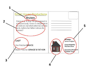
This is the back of my postcard. I believe this follows forms and conventions more so than the front of my postcard.
1:
The title on my postcard uses forms and conventions, as it is typical for the back of the postcard to keep re-inforcing the title and using it, so the public will remember the name. It is below the company name, as I feel it is more important, as to our target audience (people within the industry) it is vital that they know what company the film is from, incase they wanted to get in touch with us.
2:
The short synopsis develops forms and conventions, as they are sometimes used on the back of postcards. I decided that I wanted one as the front of my postcard didn't give a lot away, and I believe that with a short synopsis, it would encourage the audience to watch the film further. However it isn't so much of a typical convention that is used on the back of postcards.
3:
The names of the main cast members on the back of my postcard both uses and develops forms and conventions. It is conventional to put all or more cast members on the back of a postcard. However, as it is sometimes done this way, for example it is done on the 'Divine' postcard.
4:
The company logo on the back uses forms and conventions. This is used again to promote our company to the target audience, this is typically conventional for the back of a postcard, therefore I am using forms and conventions again in doing this. The position may, to an extent, develop forms and conventions, as it is typical to have it at the top, next the title, or in the bottom right hand corner. However I believe that it doesn't particularly matter where the logo is positioned.
5:
The names of the main people involved in the production is on the back of my postcard. This uses forms and conventions, as it includes the Director, the Cinematographer and the Executive Producer. This is important to include on the back of a postcard, as you need the right credit for your film if someone in the industry was interested in the writer/director etc.
Film Reviews

1:
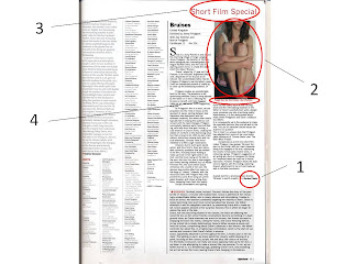
The font I have used follows forms and conventions. I made the effort to find a similar font to the original article, which I successfully did. I then followed the format and layout of the original Sight and Sound review. I even took the small details such as the shape before my Name at the end of the article is the same. This therefore follows all conventions.
2:
This pictures challenges conventions, as it is the picture from my postcard. Usually, the picture of a film review would be a picture from filming on set, or more promotional pictures. Out of all the pictures I had, I felt this was best, as it fit the frame and I believe it reflects my film well.
3:
The ‘Short Film Special’ title challenges conventions, as Sight and Sound magazine don’t typically review short films, only feature and independent films. I think that even though this challenges conventions, I still believe I follow forms and conventions of a typical feature length film review.
4:
I believe my vocabulary in my tagline and the rest of the review follows forms and conventions, as they are of similar standard. It was a challenge to be up to the standard of Sight and Sound vocabulary, as it is of a very high standard. I tried to keep the tagline short and snappy, like the one in the frozen review.
In conclusion, by using forms and conventions, it makes it clear to the preferred audience what my genre is and that it is a Short Film. This is important to present, short films are used primarily as marketing devices. However, I have also developed these forms and conventions, and challenged them, in order to make my Short Film original and unique.
No comments:
Post a Comment