Friday, 1 April 2011

Evaluation Questions- 4

New Media Technologies:


First Computer invented.


"New media technology got its start in the 1960s."


With the rise of modern computer technology, the idea of information exchange through the medium became a powerful application. Artists and designers worked to bring new concepts to fruition such as digital-based artwork and video games. These technologies became highly prevalent in the 1980s, slowly replacing traditionally mediums, primarily through the implementation of personal computers and video game systems. This was also supported by desktop publishing methods that allowed for easier image manipulation techniques and online publications."


Examples of new media technologies include Internet-based concepts like websites or digital mediums such as CD-ROMs and DVDs. Anything that is considered old media, such as television, film or paper-based products, are not part of new media.


Material Reference from WiseGeek


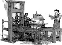
Until the 1980's, media relied on 'print' and 'analog broadcast models' (such as Television or Radio). Since then, the media has rapidly changed, with the first computer game made in 1962 (Spacewar!), to the Internet. Yet this is all still considered 'old media'. Old technologies have been manipulated through the use of digital computers, such as print, which has now been transformed so that it is digital (Adobe Photoshop).(An old Print-press)


New Media gives the opportunity for the public to increase their communications, (Facebook allows you to communicate on a global level), interactive communication (Xbox live allows you to talk and play video games with people on a global scale).


New media has changed the film industry considerably over the last century. The first ever motion picture camera made was called a 'kinetoscope'. This was a device in which you would place a series of pictures and turn a handle, as the pictures went round, with each different detail in the picture, collectively, they would create a motion picture.


(Lumiere)


However, this invention was far off what motion pictures are today. A man called Louis Lumiere was credited for inventing the first motion picture camera in 1895. Lumiere had invented a portable motion-picture camera, film processing unit and projector called a 'Cinematographe'. It is said that this invention created motion pictures, and cinema had become very popular since then.


(Arriflex Camera:)
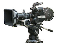
Nowadays, we use the highest quality of technology when making a feature length, high budgeted films. Camera's such as Arriflex (part of the Arri technology family, Moviecam (also owned by Arri) and Panavision models. Not only this, we have FinalCut Pro (used even in Hollywood, an editing software used for Apple Macs).


Types of new media technology may include:


· Blogs


· Blue Tooth


· Internet


· SLR Digital Camera


Computer Editing Software such as:


· Photo Plus/ Photoshop


· Adobe Premiere Pro


· Draw Plus


I have used new media technology in the form of PhotoPlus, to create my collage of new media that I use in my media course, and every day life.

1) Blogger- this is the online website in which I post everything I do in terms of my short film. It includes all Pre-Production, Post Production and the Final Product on the blog. Blogger acts as an online sketchbook, so we are encouraged to use IT in everyday life. If this website was not available, then we would have to publish all our work in a folder or sketchbook, with our Final Products being produced onto a DVD, or if DVD's weren't available, in the past, it would just be shown in the cinema for a unique showing, rather than the much more efficient Blogger website.
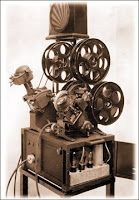


2) Adobe Premiere Pro- This is the editing software we use for cutting and editing our final product together. If we did not have Adobe Premiere Pro, in the past, people would take the positive film of a negative film, and have to physically cut pieces of the film together with the help of cutters and splicers, and then threading the film on a machine with a viewer, such as a 'Moviola'.


(Moviola)


3) Photoshop/Photo Plus 11- The software I sometimes use that is similar to Photoshop is Photo Plus 11. They do everything I need in order to edit photo's. Without this software, I would not have had the resources to edit my postcard designs, the pictures for my film review, or even create this merged new media technologies picture. This editing software has been extremely useful for all throughout my Media A-level. Usually, people would have to edit photo's by using a print press.

4) Canon 550D SLR- This is the camera I used in taking the pictures for my postcard designs, film review, and any Post-Production report pictures. It has been a key use of equipment in my A2. Without it, all my pictures, if any, would have been taken on a digital stills camera, which would not have been of quality I would have preferred, compared to the Canon. Camera's used to be Polaroid or film camera's. The film used in a film camera were expensive to be processed, whereas pictures from a digital camera can go straight onto your desktop.

5) UnsignedBands.web- This is the website we used to find copyright free music from unsigned artists to use in our short films. If we did not have access to such a website, we do not have to money to buy music that is copyrighted, therefore we would have to create our own music, or have no music at all. These alternatives are used in bigger budgeted films and is the same before new media technology. This would definitely effect our overall film substantially.

6) Sony PD150- This is the camera we used to shoot our short film. In filming, there has been a noticeable difference in the quality of film that we have shot. If we did not have this camera, we would still be using the cameras from last years Sony Mini DV camera's, which would not have produced the same quality material which we have produced from this camera. However, as mentioned above, before new media technology, people would typically use the cinematographe in filming.

7) HD Flip Camera- This camera was very handy for creating little video's explaining situations in creating our short film. Personally, we used it when we were setting up lighting, camera or sound. We also used this camera to make video's if we didn't want to explain blog posts in writing. Without this, there would be little use of IT skills in our blog posts, we would also not have had the opportunity to look back over how we set equipment up. Before new media technology, for features such as bloopers or feedback, the original camera that was used for film would be used, although feedback was typically either written down on paper, or more recently yet still before new media technology, recorded with a voice recording system, and they would use just an audio clip if producers wanted feedback.

8) YouTube- This video website was very helpful to us in our research into short films. Short Films are typically posted on YouTube, which was useful in researching how people made their short films, and it was also useful to see how they introduced their genre's in their short film. Without this website, it would be extremely difficult in terms of researching into short films, we would possibly have to buy short films, or look for alternative websites that posted short films, which inevitably is still using new media technology. Without using new media in the research and distribution of short films however, there are short film festivals that are useful to attend, as there may be a possibility of meeting the distributors and producers.

9) Wikipedia- This website was used in the research of our short films as well. This website gives you information about most subjects, including films, directors, equipment used in film, everything. I used to website as a starting place in all my research, so it would give me the information of what to look for in more detail.


Without this, people would originally go to library's to find their information. Because of Wikipedia (and other Internet based information websites) it is easier, quicker, and more efficient than a library, as for a media course, it is hard to find books on media in a library. However, library's are still useful for finding information on the history of film, and other subjects and general reading.


It is clear through my research that in early developments of technology, the process of making and film seemed time consuming, complicated and very expensive. With the help of new technology, I have found that the production of our film, my postcards, and my film review, that all the new technology I have used and have had access to has helped me greatly in producing a high quality short film, in the space of weeks with a next to nothing budget.


Without realising, these new technologies that are mentioned above, have become part of mine and Jenna's every day life, which is why the process of making the Short film and all the promotion products that go with it, have come natural to us. I feel fortunate to have access to such new technologies, and am sure that people in the future will look back at our generation and say the same about their newer developed technologies.

Evaluation Questions- 3

After our Short Film, Film Review and Postcard had been completed, our next task was to receive audience feedback on them. The aim of our task was to ask a range of people, from parents, to teachers, to our target audience about each product. Receiving such feedback allows us to to hear different opinions, with both positive comments and critical comments, so we could improve our products or consider how we would do things differently in the future.


Bruises

First of all, we received some comments from our parents. Once our final product was complete, I showed my parents the DVD, as Jenna and I decided that if we were to have a target audience that didn't include people in the industry, it would be parents. After collecting the notes from the feedback from parents and teachers, we filmed them on the Flip camera.
It was important that for evaluation we needed constructive criticism, so I made a series of questions to ask, in order to get the preferred reaction.


As a collective, from parents, teachers and people within the industry, we thought there were a mixture of comments, but many of them were similar. We received a lot of positive feedback, merely from the reflection of the font to the character of 'Grace' and how the music choice complimented editing of the shots. We also found that most people liked how the father is unidentifiable, creating a menacing character, which is important to develop and construct in a short film.


However, there was a critical comment which appeared a few times during feedback. There was a confusion about the conclusion, and how the ending didn't make as much sense as Jenna and I had hoped to portray. We received a comment about how it wasn't clear that we aren't meant to know if the father is physically abusive to Grace, creating her bruises, or if it is Grace, self inflicting the bruises on herself.


If we had the chance to make this product again, I think that the use of props in the film would aid us enormously. I believe if we had an art set in the final scenes, and maybe more use of the drugs in Grace's bag, the message of a murder or suicide would be clear. I would choose less aggressive scripting for the father, as people believed that it was clear the father was abusive, and no interpretations of Grace self inflicting much.


This is my media teachers (Lindsay Rolfe) feedback:


As Miss Rofle is our media theory teacher, it was helpful to recieve her feedback. She made me realise all the conventions about the film that were good that I hadn't noticed before, such as the font of the title 'Bruises', reflecting the character of Grace. Her criticism was also very helpful, with which Jenna and I have recognised where we have gone wrong, and what decisions we will make in the future to ensure that these confusions about the final messages will not happen again.


I then asked Sara Thomson, a screenplay analyst, to read over my script and watch my final product.


This feedback has been incredibly useful for me. Having someone in the industry comment on my short film has helped me understand the importance of how the script is developed in production. Sara referred to how the script is reflected in the film, and that it was written well, however the lack of dialogue was somewhat difficult to develop the character of Grace.


However, she did mention how the film develops Grace's character well. Sara also gave me feedback on the film, which was helpful, as it gave me an insight into what people in the film industry may look for in the short film. She mentioned how the ending lacked in clarity, this is a fundamental comment, as it was one that was made often in my feedback.


Postcard and film review layouts:


This is my mum's postcard feedback:


The feedback I received for my postcard was positive and most people I asked commented on the effectiveness of the product, as well as the overall product, which is a good reaction. However, there were also a few constructive criticisms. This is an example of feedback I received. I was also told in feedback that my postcard needed more on the front, as they thought the minimalism didn't draw them in, even though for a lot of people, it did.
Also that my postcard didn't have a tagline on the front. This is conventional for a postcard, however, my aim was to challenge most conventions for a postcard, as I thought this would only draw the audience in, as it is different from most postcards that promote Short Films.


This is my mum's feedback on my film review:


The feedback I received from my film review was what I was expecting. Most people I asked said the same thing about the picture, and how maybe there should be another one, which I didn't agree with as this didn't follow the conventions of a Sight and Sound review, or choosing a different picture from my postcard one.
Although promotional pictures are conventionally used for the pictures in film reviews, if I had the choice to change it or do it again, I would possibly choose a different picture as well.


Overall, I believe the audience feedback I received has been very helpful in my editing of my final products. Due to my audience feedback, I have edited the font on my postcard and made the colouring more blue. With my feedback on 'Bruises', I have recognised the errors we have made in our film, and this is important for future reference.

Evaluation Questions- 2

Postcards:

I designed 3 different postcards, for the promotion of my Short Film 'Bruises'.


These were the front designs of my postcards, as I always had the idea for the back of my postcard. These helped me developed and picture my final design. I created three different designs which were stills from a digital camera, as I wanted to follow the conventions of having a promotional picture on the front. All three of my designs were in different locations. One of the designs were located outside. The other were located inside.


My first design was of GRACE standing on a bench in a wooded area. this was my first design, which I designed earlier in the year, therefore it didn't follow conventions as there wasn't much relation from the film to this design.
After this design, I decided to have the locations inside, as this is where GRACE is normally situated, either in school or in her home.


I decided that for my second design, I would choose to have everything that is related to GRACE thrown onto a table, including her art set, a phone (for the scene where GRACE first recieves abuse from the father) and a painting of a grape (for the art classroom scene). This I thought would also give the audience an idea of GRACE'S character, and tell them a little about the storyline, without giving too much away. I then had the name 'GRACE, 11p' written in the foreground, as this developed GRACE'S character again without revealling too much.


In my final design, I took the idea of splicing off the head of GRACE in the postcard from the film, as we frame the shot so the fathers head isn't in shot in filming for the Short Film. I thought that by doing this, there was a clear connection of the postcard to the film. I decided to contrast the Black bold writing against the whitewashed wall, to show the significance of bruises in the film, and how they are always with the character of GRACE.


After completing my designs for my postcards, I decided to go for my third design. I decided this was the best for my postcard as it relates to my film the most. In this way, it uses conventions, however it also breaks from conventions as it doesn’t have a tagline or a full cast picture, breaking forms and conventions is always something I look to do in my products as I believe that it makes your product original.


I found it relatively easy to edit my postcard on Photoshop, However I felt I did choose the easier design, not for practicality, but I thought it was more effective to have a minimalist feel. I asked a few colleagues in my classes and they agreed on this design, which I was pleased about. I think that my postcard is effective, as it portrays the mystery in my film and also is a direct link to the father in the film. It is also effective as it doesn’t give too much of the film away.


However this is my journey of how I made my decision on my chosen postcard design.


First design:


I liked how the red contrasted with the greyscale background. The setting I believe is visually pleasing, however, it doesn’t link to my film, and even though this breaks conventions, I believe for my postcard to be effective, it has to show some relation to the film. As the girl in the picture isn’t the girl we used for in the film in the end, this design wouldn’t be effective at all


My second design:

This shot gave me the idea for my second design. This scene I think reflects GRACE'S personality perfectly, and this was the aim of my postcard. I decided then that I would take this painting of the grape, as it is meant to represent the suggestion that GRACE may self inflict her bruises, as she can mix the correct colours.


This design is more effective, as it has a number of objects that is related to the character of Grace. These objects include an art set, a drawing of grapes, and a phone (related to the scene where we first see abuse from her father). In the foreground is her name and year group, this provides character development, but again doesn’t reveal too much about the film. I liked the colouring of this picture; I did this by increasing the saturation and using the shadow tool to create harsh light, in Photoshop. Despite the fact that this design is effective for my film, I decided to use the postcard design that reflected the film more, with the minimalist feel. This design doesn’t do this as the picture is visually ‘busy’.


Final Design:


For this design, I used the shadow tool again to increase the light, making more of a shadow on Grace. This is effective to my film, as the shadows of Grace’s father in the film are an important feature, representing the menacing character of the father. I used the paint brush tool, and chose a dark blue. I made it softer, so the colour wasn’t too harsh, making the photo obviously blue. I wanted the blue to be subtle like it is in the film, as it reflects Grace’s mood. As my postcard photo is taken in the location of Grace’s room, I thought that having the blue colour was a direct link again to the finished product. The font is simple and childlike, which is a suggestion of Grace’s character, I wanted it to be black and bold as well, as this keeps to my minimalistic idea, also it contrasts against the whitewash walls behind it, which is another link to my film, as seen in the titles (this is explained below in the picture below).


Due to these conventional factors, I believe my final postcard design is effective, reflecting my film yet not revealing too much about the film. They share similar conventions, such as the title of ‘Bruises’ and the title on my postcard, and the picture linking to the character of Grace’s father. I have also included the production company name in both products, and the names of the cast members.


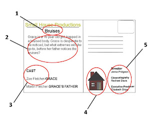
The back of my postcard is also effective, as it provides a short synopsis fo the film. This develops conventions, as it isn't always typical of a postcard promotion. However I believe that a synopsis is neccessary, as it entices the audience to watch the film, if they are not fully inspired by the design on the front. It uses conventions of a postcard as well, including the company logo and name, and the title of the film. These are all effective, below is a diagram of how both the front and back of my postcard uses conventions, and how they are linked to film, making it an effective product.


Film review:


For my film review, I chose to reproduce a ‘Sight and Sound’ magazine review. I decided to choose a ‘Sight and Sound’ layout as it is recognised in the professional world. For film reviews, it is typical for them to be marketing devices for getting recognised in the film industry, therefore I believe that by making my film review a ‘Sight and Sound’ review, this would follow conventions that I use in my products. However, for ‘Sight and Sound’, they do not review Short Films, it is conventional for them to review feature length films. Therefore, I am breaking conventions here by doing this, and overall, it is effective for my film as I am reviewing my product in order for my target audience to read it.


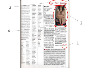
The main feature in my film review is the picture on the right. This picture is from my promotional postcard, which is effective, as there is a link here between one marketing products to another. I did this to make my film review effective, in the way that if people were to see my postcard, and see the same picture on my film review, they would recognise immediately which film is being reviewed. Even though this was criticised in my feedback, I believe that to make my film review effective, this had to be done. Below the picture is a tagline. This says ‘tough love for first timer’, this is effective in the way that it links to the film, as ‘Bruises is about abuse, and Jenna is a first time director. The vocabulary used in my film review is typical of a ‘Sight and Sound’ standard. This is also effective, as by using technical vocabulary, it would be recognised by someone in the film industry as a prestigious film review.


In my film review, I wanted to provide an understanding of the film, in an attempt to convey the messages and ideas of the Director. Not only did I talk about the director, I also mentioned the roles of the camera crew, the lighting, the sound and the actors. This is effective as for an industrial magazine; professionals do not only look for new and upcoming directors, but search for new talent to work for their companies for example. I mentioned the positives of the film, and criticism, with the help from my audience feedback, this is so it is true to a real film review. I also mentioned the original shot angles, as this is a feature used in the film to convey the vulnerability of Grace.


Below is a diagram of how effective my film review is in comparison to my film. I have inserted arrows to visualise the links of my film review to the film, for example, I have linked the information at the top of the film review with my credits that appear in the film.


Overall, my film review is effective, as the conventions I have used in my film review are typical of a ‘Sight and Sound’ review, which is known by professionals in the film industry. I have used the precise layout of an original article of ‘Frozen’ from an edition of a ‘Sight and Sound’ review.

Evaluation Question- 1

This question allows me to recognise if my film uses, develops or challenges conventions of a short film and real media products. This question requires 16 screen grabs of our final product, and a brief description of how they use, develop or challenge conventions.


Screen Grab 1:
This screen grab shows the opening shot of the film. As seen, in post-production, Jenna and I decided to start with action. This challenges conventions as it is typical for short films to start with the title of the film, and possibly some other titles such as names of the cast.

Screen Grab 2:
This screen grab is our main character 'Grace' running into her room. This challenges forms and conventions, as so far in the opening of the film, we know very little about the film so far. However, it also uses conventions, as we start with focus on our main character, which is typical for a short film.


Screen Grab 3:
This shot here uses forms and conventions, as the font and colouring is child-like, which is a trait of our main character. It is also minimalist, which is a theme throughout the film, which is typically connoted in the title with the name of the film.


Screen Grab 4:
This is the short after our title appears. Here we are still challenging conventions, as we have had very little dialogue so far, and the only dialogue we can hear currently is muffled, as Grace is in a daydream. However, we are still using forms and conventions as we are still focused on the main girl, and have currently not seen any other characters in the plot.


Screen Grab 5:
This shot uses forms and conventions, as it establishes the age group and situation Grace is in currently. The mise-en-scene and setting up a recognisable surrounding follows conventions of a short film. The dialogue is muffled in the background, this uses forms and conventions as it is and edit people would expect for someone who is in a daydream. However challenges codes and conventions as there has been little dialogue so far.


Screen Grab 6:
This shot develops forms and conventions, as it depicts the emptiness of Grace, however I believe it develops conventions as the shot is still on the opened door, as a whole scene. This is unusual, even though it uses the conventions of depicting the mood and feelings of the main character. The long shot helps to emphasise this, allowing the audience to relate to the feelings of Grace, in turn using and developing forms and conventions of a short film.


Screen Grab 7:
This shot here challenges forms and conventions, as you can't see the father's face, despite it being the first time we see him. He remains unidentifiable throughout the film. This shot reinforces the fear Grace feels for the father, and having a low shot with both Grace and her father in it aids the audience to relate to Grace, and the menacing character of her father, which is arguably using conventions.


Screen Grab 8:
I think this shot challenges and uses forms and conventions. As the extra in the foreground walks across screen, the atmosphere changes. This is enhanced in editing, with a blur and slow motion, which is spilt, so Grace is still in focus. This challenges forms and conventions as it isn't a typical edit that is seen in a short film. However, it uses conventions as it establishes a typical teenage girls friends, and conversations in a school environment.


Screen Grab 9:
I think this shot uses forms and conventions but develops them too. The menacing shot of Grace's father is enhanced with an over the shoulder shot from Grace's point of view. Her father looks menacing because of this, and the audience shares Grace's fear once again because of this. It uses conventions because of this, however it develops forms and conventions because of her father's head being out of frame, to keep him unidentifiable, which add's to the dark implications her father suggests in the short film.


Screen Grab 10:
This shot uses forms and conventions as it establishes Grace's life, the emptiness of her life which is reflected in this shot of the house in a dark surrounding.


Screen Grab 11:


This shot uses forms and conventions, as again it establishes Grace’s age and her hobby for art. The grapes that Grace is painting are deliberate, as they are similar colours to bruises. This is the suggestion that Grace self-inflicts her bruises, as she knows how to mix the right colours.


Screen Grab 12:


This screen grab uses forms and conventions. The framing of Grace suggests her vulnerability. Her clothing is typical of a young girl, and she is engaging in feminine activities, such as drawing, surrounded by her make-up set.


Screen Grab 13:


This shot develops forms and conventions. The mirror makes the room look bigger, again emphasising Grace’s vulnerability. This shot develops forms and conventions as we can see her father entering the room, we can assume her fate before Grace is aware of it. This dramatic irony isn’t explored often in Short Films, as it is sometimes difficult to develop in a short time.


Screen Grab 14:


This shot uses forms and conventions, as it reveals the messages we wish to convey in cleverly placed props and shot angles. The drugs in Grace’s bag suggest she may commit suicide, the father lingering in the doorway suggests he may murder her. However, I think the different shot angle however develops these forms and conventions.


Screen Grab 15:


This shot uses forms and conventions, as the red light emitted from the television suggests and evil character to the father. The shot however challenges forms and conventions, as we still can’t see his expression, and therefore the audience cannot tell if he has killed Grace or not.


Screen Grab 16:


This shot challenges forms and conventions as camera has so far only shown extreme close ups of Grace’s body, so the audience isn’t fully aware of what it is that is being shown in the shots. This is unusual for an ending scene in a short film.


Postcards:


1:
The whitewashed, simple background add's a minimalist effect to the postcard, which I wanted to convey in my film, as the simple surroundings makes the audience focus on 'Grace' in the picture. I think this is unconventional as it is typical for lots of colours to be used, to attract the audience's eye, yet I believe by doing this, the audience are more attracted by what I could be conveying in the minimalism of the postcard.


2:
The picture of Grace is to the left of the postcard, and we can't see her face due to editing. This too is unconventional, as it is typical for postcards to have a main cast picture or the protagonist centre, fully seen, maybe surrounded by objects that are important in the film. Therefore, the unusual positioning challenges conventions, and can draw attention to the title, and the bruises on her body.


3:
The bruises in the picture were enhanced, so they are easier to see. I think this uses conventions as it is the main concern of the film, which is typical of a postcard to show, as it gives the audience an idea of what they should expect in the film.


4:
The title of the film is the clearest in the picture. This uses conventions as it is critical for the audience to see the title of the film. However I believe my title develops conventions, as titles tend to be centre, along with the picture, and also elaborate in colours or fonts. I decided to use a simple font, as this again draws more attention to the character in the picture. Also, it is a simple black with a grey shadow on the text, which again creates a minimalist tone to the picture, developing and challenging codes altogether.


This is the back of my postcard. I believe this follows forms and conventions more so than the front of my postcard.

1:
The title on my postcard uses forms and conventions, as it is typical for the back of the postcard to keep re-inforcing the title and using it, so the public will remember the name. It is below the company name, as I feel it is more important, as to our target audience (people within the industry) it is vital that they know what company the film is from, incase they wanted to get in touch with us.

2:
The short synopsis develops forms and conventions, as they are sometimes used on the back of postcards. I decided that I wanted one as the front of my postcard didn't give a lot away, and I believe that with a short synopsis, it would encourage the audience to watch the film further. However it isn't so much of a typical convention that is used on the back of postcards.

3:
The names of the main cast members on the back of my postcard both uses and develops forms and conventions. It is conventional to put all or more cast members on the back of a postcard. However, as it is sometimes done this way, for example it is done on the 'Divine' postcard.

4:
The company logo on the back uses forms and conventions. This is used again to promote our company to the target audience, this is typically conventional for the back of a postcard, therefore I am using forms and conventions again in doing this. The position may, to an extent, develop forms and conventions, as it is typical to have it at the top, next the title, or in the bottom right hand corner. However I believe that it doesn't particularly matter where the logo is positioned.

5:
The names of the main people involved in the production is on the back of my postcard. This uses forms and conventions, as it includes the Director, the Cinematographer and the Executive Producer. This is important to include on the back of a postcard, as you need the right credit for your film if someone in the industry was interested in the writer/director etc.


Film Reviews


1:


The font I have used follows forms and conventions. I made the effort to find a similar font to the original article, which I successfully did. I then followed the format and layout of the original Sight and Sound review. I even took the small details such as the shape before my Name at the end of the article is the same. This therefore follows all conventions.


2:


This pictures challenges conventions, as it is the picture from my postcard. Usually, the picture of a film review would be a picture from filming on set, or more promotional pictures. Out of all the pictures I had, I felt this was best, as it fit the frame and I believe it reflects my film well.


3:


The ‘Short Film Special’ title challenges conventions, as Sight and Sound magazine don’t typically review short films, only feature and independent films. I think that even though this challenges conventions, I still believe I follow forms and conventions of a typical feature length film review.


4:


I believe my vocabulary in my tagline and the rest of the review follows forms and conventions, as they are of similar standard. It was a challenge to be up to the standard of Sight and Sound vocabulary, as it is of a very high standard. I tried to keep the tagline short and snappy, like the one in the frozen review.


In conclusion, by using forms and conventions, it makes it clear to the preferred audience what my genre is and that it is a Short Film. This is important to present, short films are used primarily as marketing devices. However, I have also developed these forms and conventions, and challenged them, in order to make my Short Film original and unique.

Post 20- Final Product

'Bruises'- Final film.


Film Review:


My film review:


Shot on a Sony PD150 in and around the charming village of Kings Langley, Jenna Pridgeon , the director of the film, works alongside her cinematography colleague Rachael Davis, and her cast of aspiring actors to be, to create the latest short film debut ‘Bruises’.


‘Grace’, played by 17 year old Zoe Fletcher, is an innocent, frightened adolescent, desperate for her bruises to be noticed. Her unidentifiable father, Martin Pridgeon (Pridgeon’s real life father), gives Grace an unexpected present of make-up, to cover up the distressing evidence. Or not.


Pridgeon creates an unpredictable twist to the story. The audience is left questioning whether Grace is being abused by her father or if she is inflicting the bruises on herself, with help from her make-up set, and clever shots suggesting drug use.


As Pridgeon’s film is a short, we are propelled into the mind of Grace at the quickest of paces, darting between fear-happiness-love-depression and her extended creativity. But where other shorts typically fail in keeping the audience conversant with the rapid changes, Pridgeon successfully balances each mood and feeling, with help from blue gels, forcing a cold emotion in Grace’s home, creating the oddest of comforts in the distressing situation that is Grace’s life. With its dark implications, distinctive camera shots and musical interludes, ‘Bruises’ feels much indebted to a Mike Leigh masterpiece.


However, due to such quick paced action, and time limit’s, there are noticeable continuity problems that are evident in the film, including Grace holding a make-up brush in her right hand in one shot, and the brush laying on the bed in the next. Not only this, due to low-budgets and limited editing software such as Adobe Premiere Pro, the scene where Grace immerses into a world of her own, the obvious slow motion effect can seem on the verge of ‘cheesy’. However, with the resources Davis and Pridgeon had, they prevent this scene from being an unmitigated disaster, with clever acting directions, snapping Grace back into reality.


Unique camerawork and lighting from Rachael Davis, such as low tracking shots and the intimidating shadows of the father on Grace’s painfully bare walls, dangerously immerses you into a terrifying reality. Nevertheless, it is the denouement which really shows Pridgeon’s and Davis’ collaborative efforts.


It is consequently up to the audience to make the inevitable decision they are left with in the end. This use of narrative closure forces the audience to question


This in itself is a unique style that Pridgeon has adopted from some of her most admirable influences of ‘Donnie Darko’ and ‘The Blair Witch Project’.


Exceptional as a first time short film-maker Pridgeon may appear, ‘Bruises’ borders on the cliché, with our main character being fully engaged in the arts, expressing her clearly immaculate creative skills, in colouring a grape. Pridgeon’s suggestion of art acting as a form of escapism for Grace isn’t explored nearly as much as it should have been. However, Pridgeon allows the audience to digress with the ending, exploring Grace’s attachment to her art and make-up sets in the fatal conclusion.


A great start for a promising new director, ‘Bruises’ is worth a watch.


At first I thought 'Bruises' would be a certificate 12, as there wasn't a lot of physical abuse or graphic images. However, after reading the certificate policies online, I realised that our film was infact a certificate 15 due to the swearing and the violence.


Here is the online website to the policies of a certificate 15:


http://www.screenonline.org.uk/film/id/592478/


Postcard:


Post 19: Post-Production Report

As soon as filming was completed, we went onto capturing our footage and editing our Short film.

We only had a few minor problems, as on the day of filming we always made sure that we had the microphone on. The main problem we came across was that Jenna could be seen in the reflection of a mirror in her room. However, this was easily solvable, as we had enough extra footage from different angles to create a sequence that flowed well without being able to see Jenna in the mirror.


Jenna and I both shared input into what takes to use and where to cut etc. We both found that most the time, we shared similar idea's, which was helpful as editing then took half the time we expected it to.
We decided to edit in order of how we filmed, rather than scene-by-scene, as they came in order of length, for example, one of the first scene's we edited was scene 14, Grace's death.


We had filmed footage for audio, so we had some silences without unwanted noise. We used this in the end scene's, as there was an unwanted hum from the microphone all throughout the footage. We used the audio from this footage, and it still provided us with atmosphere, therefore we were pleased that we made the decision to film this extra footage for audio on the day of filming.


The most difficult experience we had with editing was the school scene including Grace's friends. We found that Jenna and I both had strong views of how we expected the scene to look. Obviously it didn't happen as we expected as we are working with a next to nothing budget. Jenna and I worked to the best we had, we ended up with something similar to what we pictured. Below is a picture of the scene we were editing, this is before we added effects:


This is what it looks like after adding effects:


After slowing the footage down and adding the 'cut', where we spliced the screen next to Zoe's shoulder, we added a blur. This created the effect of Grace being in focus, and her friends being blurred, this suggested that Grace is daydreaming and isn't focused in every day conversations anymore.


After we crossed this bridge, the only other problem we had was an issue with lighting. We decided that the art room scene wasn't as 'warm' as we wanted it to look.

Therefore we changed the colouring on the whole scene, this is how both before editing and after editing looked:


As seen, it is clearly a much warmer atmosphere in this scene, which was our aim as we wanted to portray Grace's happiness when she is in school away from her father.


This is another example of how we changed the lighting, this is how it was originally, and clearly in the finished product, it looks like a happier, warmer setting with the same change of colour as the shots above.


After this, we editied the lesson scene. The only problem we had with this is that the sound wasn't synced with the action. However, this is deliberate, as we wanted continuity to match, and as we edited the footage so that the sound in the clip before was slowed down and muffled, this problem was inevitable.
However, although the sound isn't synced for a minor part of the shot, we don't see the person speaking in this, therefore the sound doesn't look out of place.


After all the action was edited and cut together, I worked on the sound, mixing the levels with the cross dissolves on the end of the action. This was quick and easy, as they were skills I had picked up from my AS media course.


After this we made a decision on the music we would use. We used the popular website called unsignedbands.web to get copyright free music for our film.


We had a choice between two, and in the end decided that we didn't want a lot of music in our film, as we thought it would detract from the footage we had.


In the end, the music was helpful for us, as the beats of the music fitted with our footage very well. The music added the eeriness to the scene with Grace's father watching television, and for Grace's death.

Once the music had been added and mixed with the action, we started on Titles.
We deliberated on a number of ways to introduce the title at the beginning of the film. In the end, we chose to cut straight into action and have the title appear on Grace's door, and slowley fade to black. We did this to challenge forms and conventions in our film, and thought that it was more effective, as Grace looked more vulnerable cutting straight into action.
We decided that we wanted the font to be simple yet effective. We chose a black background and have the white title in a simple font. This is so the title reflected my postcard as well,
as I have a white background with a plain black and bold title.
We added a little bit of shadow to the font angling it to the right, and a purple hint to the colour, to match the theme throughout the film, so the title wasn't too boring and plain.


We chose to have the credits, including all the casts names and ours, at the end. We decided on this, as we didn't want to detract from the action at all, therefore we left it all until the final scene had faded to black. We then had the music continuing, as the credits rolled over them, we thought this was the most effective, to having no music at all during the credits.

Once this was all completed, we rendered the film, and that was the end of editing for 'Bruises'.

Post 18: Production Report

First attempts:

On Thursday 10th March, Friday 11th March and Thursday 17th March, we started filming ‘Bruises’, starting with Shot 1, Scene 1 on Thursday 10th. The first day was a success; we filmed everything that the shooting schedule suggested we shoot on the day. However, when the Friday approached, we came across a few problems. Our actors told us they could only stay until 6:00pm that evening, so we ended up only filming half a scene, out of the three we were meant to be that day. Jenna and I decided to schedule another day in which our actors could make for the whole day. On Thursday 17th, our actors again couldn’t attend the whole day. This was becoming problematic for Jenna and I, as we preferably wanted to get filmed in those three days. We then had to schedule two more days. On the two days we scheduled, our actors told us they couldn’t make it again, and on the second day of re-scheduling, the rooms in the school that we needed to shoot in weren’t available when we could film.


Due to these problems, we have decided to re-shoot, with different actors, on a day in Easter, so we can spend a whole day to film all the scene's in the house.


Plan of the day:


We decided on two separate days to film with a new actor playing the father. We chose Jenna’s real-life dad, as we thought it was more realistic and used forms and conventions rather than having a teenager play the father, and because he was reliable.


We chose to film one day in Easter, and a day in school for all the shots that are in a school setting, we wanted students of the school in shot as well; this is why we decided to shoot on a school day, to make it a more realistic setting.


On the first day, we started by sticking blue gels to all the lights in the house, as we want the house to physically look cold and have an unhappy tone to it. This was done by cutting up the sheet into small round pieces, to be stuck over the spotlights in Jenna's kitchen. Then we clipped a large piece over the main light source in Jenna's bedroom and any other lights that were on in the house.


This was where my post 12 advanced workshop came to use, as I applied my knowledge of light manipulation when setting up the lighting for Jenna's bedroom. We wanted to be able to see the father's shadows on the walls and on 'Grace's' face. However this proved difficult, as we could see too many shadows of the camera on Zoe's face if the lighting was too harsh, therefore we didn't quite get the effect of the shadows as much as we hoped, but there were still some. In the future, I would take this into account, maybe try more lighting positions, which was difficult for us, as there was little space to manoeuvre with me on camera, the lighting positioned in the hall and the actor trying to get into the small doorway into Jenna's room.


When filming, we took pictures of positions of props, in order to handle issues such as continuity. This proved very helpful, as we kept continuity issues to a minimum. We made the decision on the day of having just a make-up set on the bed, as the art set didn't use forms and conventions as it was a box of crayons, which looked quite childlike. Therefore in the future, we would plan our props more carefully, as this was the only art set we had between us.


What we also decided in this scene was to have the father sweep the make-up onto the floor, as Jenna has white walls, which we were frightened of ruining if we were to throw make-up on. We discussed the possibility of putting a number of white pieces of paper on the wall and adjusting the lighting so it looked like the wall, but we thought it would look better visually if we had authenticity of a floor or a wall. Therefore we decided to throw it on the floor, which inevitably, due to editing as well, looked more conventional.


Postcard designs:
When filming 'Grace's' death, I took my pictures for my postcard designs, as we had just put make-up bruises on Zoe. After the scene was finished I took a number of photo's for my final design. This is an example of the pictures I had taken, also showing the make-up design skills that Jenna had in applying bruises on Zoe's skin.


This is a video of Jenna applying the bruises to Zoe:


Next we had a few other problems with the scene including Grace's father sitting in the living room. The natural lighting was too strong in the living room, as there were various windows, including two large french doors. Also, the blinds and walls in the room were yellow, therefore it gave the shot more of a warm feeling, whereas we wanted the blue tone to the shot.
Therefore we left that scene till the end of the day. In the future, we will have to take the colours of the room into consideration, as we didn't realise the effect the yellow blinds would have on the overall shot.

We moved on to the first scene's, in which we had some problems filming Zoe running up the stairs. There was little room to see the camera screen, therefore the first few shots were wonky. However, having learned from filming first time round having the similar problem, we remembered to rewind the tape and check to see if it was ok, and filmed it again.


Finally, we filmed the last scenes of the day, which was the scene with Grace’s father in front of the television. We tried a number of camera positions, as the original place we had on the shot list and storyboard didn’t quite work in Jenna’s front room.


We tried a high shot, but as there was little support, we thought it was too unstable and you could tell in the footage. We decided on the shot behind the Father, switching television channels. We decided this was visually best as well, as you could see the outlines of the father due to the dark room and the television being the only light source.


The only other problems we had with lighting on filming on the first day was sorted, as we put black bin bags over windows to stop so much natural lighting coming into the rooms.


We also had to film the shots outside Jenna’s house. This proved problematic, as it was too light outside to see the lights flick on. Therefore we turned on the ‘spotlight’ button on the camera, which made the shot seem significantly darker. We were pleased with the decision we made on the day to do this, as you can clearly see in the film the lights on in the house.


The only other problems we had with lighting on filming on the first day was sorted, as we put black bin bags over windows to stop so much natural lighting coming into the rooms.


Second day of shooting:


First we started with the classroom scene with the pupils and teacher.


We arranged a year 11 class and a teacher to film with us on the day, however unfortunately we didn't have a lot of time with them, so we decided to run through the camera angles and positions we would have for each shot to make filming run smoothly. This proved a great decision for us, which we would consider for future filming, as it cut a lot of time trying to get the shot to look right when the actors are involved.


After this, we filmed the art room scene.
We found this similarly simple to film, however, there was a classroom scheduled in there when we were filming. This proved helpful to us in the end, as the class was a year 11 one, which is the year Grace is meant to be in.
There were a few problems with noise levels, as there was a pupil working on the sewing machine on the day, but we asked her to stop whilst shooting. Apart from that, there were little problems.


Finally, we moved onto the quad scene. This proved slightly more problematic, as it was lunch time, there were pupils moving around and it was tremendously windy that day, therefore the sound levels were a slight problem. We decided that the actors we were going to use for this scene playing Grace’s Friends were not right for the part, as they didn’t look old enough, therefore we changed the actors, and we were much happier with this decision in the end.


That was the end of production.