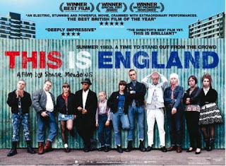
A Title: The title of the film. This is important, obviously, in order for the public to see what your film is, and what you are advertising. The title is normally bold, as it is important for the public to know what the film is.
A Tagline: Posters tend to have a tagline underneath a picture, or the title, as a marketing technique, to draw the audience in. This tagline should be quick, snappy, and relevant to the film itself.
Visual codes: On posters, this usually comes in the form of a picture. This picture can be taken from the film itself, or can be an arranged photoshoot of the main characters, locations, props, anything that's of main importance to the film. For a high budget film, the poster may include a character who is of high star rating, in order for people who recognise or like the actor/actress, they would be encouraged to see their latest feature film. This creates more revenue for the film, and so this is a typical marketing technique for high budget films.

 This is an example of a new American Hollywood film release, called 'Source Code'. Unlike 'This Is England', it provides the audience with the names of the actors/actresses, this is because they are of noticeable status. The tagline is at the top, which is similar to the 'This Is England' poster, and by doing this, catches the audiences attention quicker. The picture of of Jake Gyllenhaal, a well known actor, who is surrounded by pictures of the events that occur in the film. This is typical of a high budget film, and develops a character profile in the poster. He is clearly distressed, which suggests a genre to the film, maybe a dramatic action film. The pictures are typically made up of white, middle class citizens, usually consisting of the woman who is heavily involved in the plot too. This may suggest a more high-budgeted, hegemonic views, which is completely different to the views in the 'This Is England' poster. High-budgeted films, compared to low-budgeted differ in a number of ways. It is mainly the casting, and the importance of well recognised actors. It seems as though, in these examples, the British film give more away, in a sense of plot and character development, and provide the audience with a sense of what the film is about, rather than the high-budgeted conventions of the American poster, who chooses to portray a high-quality edited picture of the protagonist.
Short Film advertisements:
 In terms of short films, typically, there is a different approach to advertisement. As Short films are small, and usually made for a niche audience shown in one cinema for a number of days, film posters like the ones used for high-budgeted, feature films, can be expensive and unnecessary. Therefore, usually, Short Films tend to advertise with 'postcards'. These postcards are literally a typical postcard, a picture on the front with the information on the back.
The front follows the typical conventions of a film poster. On the front is a picture of the protagonist and other important characters if they choose, the title of the film and a tagline. On the back is where you will find contacts, distributors, the cast and crew names, and any other important information. These postcards are useful for small Short filmmakers, as they can hand out their postcards to anyone and their targeted audience, with half the price and with more efficiency than film posters.
For my short film, I will follow the conventions of a postcard.
When we decided on what we wanted our logo to say, we got to thinking of names. After much deliberation, we decided on 'Small House', as it combines the idea of 'small' or short films, and an 'Art House' movie. Once this was decided, we st arted to think of a design.

So in the end we googled 'Small House', and we found a picture that seemed perfect for our ideas.
This is our Production Company Logo that I made in Photoshop, which will appear next to our short film information:

We found the image of the house on google images, under 'Small House'. Then I took the design further and adapted it in Photoshop. We made the colour of the house a little darker, and we added the words 'Small House' in yellow, sideways, on the door, so that the words stand out on the house.
Overall, I am pleased with our production company logo, and I believe it follows all the conventions that Jenna and I wanted to incorporate.

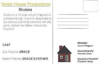
This is the back of my postcard:
 I took the main idea's of the back of my postcard from the 'Living on the Edge' postcard (as seen above).
I chose the back of my postcard to be more informative compared to others, that just give the information about cast and crew involved in the film. I wanted to add a short review of what the film is about. This is so our target audience are drawn in, as our short is gritty, so I wanted to make that very apparent in the picture, and in some information. Not only this, I believe it broadens our preferred target audience. Because of the short synopsis, it doesn't leave too much to the imagination, without giving much of the plot away, I prefer this to no synopsis at all, as a member of the public may not pay much attention to the postcard if the design isn't to their taste. As with my design, if the design on the front isn't to their taste, they can simply read a quick synopsis and decide for themselves after that.
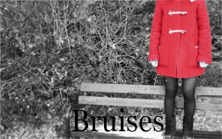
For the front of my postcard, I mainly focused on the 'Divine' postcard layout. I liked the idea of just a picture and the title of the film on the front, and the information on the back. These are some designs of what will be on the front of my postcards:
First Design: I liked the idea of contrasting the  red with the black and white. The font is Veranda, a simple and clear font. I prefer fonts such as these to the Lucida Handwriting, as it is sometimes too difficult to read, and I like how simple the overall look with the font and the picture, as our short film explores the idea of the loneliness felt when experiencing child abuse. I believe this breaks away from typical conventions of a postcard, as it doesn't have a full cast photo, and it doesn't show the main girls face, leaving suspension to the audience.
However, this design is unusable, as the girl in the picture isn't the one we chose in the end for our short film. I do however like the colours, and may choose to incorporate this in another design.
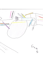
Second Design:
 This is my third design of my postcard. This is my favourite design so far, as it has the most relevance to the film. It has Grace's name, along with the title of the film in the foreground, and everything that is associated with Grace or the film in the background. It includes an art set which is centered around
 Grace's life. the drawing is of a grape, which is what Grace is drawing in the film in the art scene. In the back ground, there is also a phone, which I think is also relevant, as the scene where Grace's father has the school on the phone is one of the scene's where Grace's father's true self is revealed. I like the colouring of the picture as well, as it has many colours, which appears happy, which Grace is when she is drawing, but it also has a cold feeling to it, which is the underlying feeling Grace feels throughout the whole film.
Third and Final Design:

This is my final design for my postcard. On the front, appears the actress who is playing Grace, holding her knees, covered in bruises. I think this is the best of all my designs, as it gives the audience an idea of what the film is about,  however I think that it follows typical conventions of a postcard. To break away from it, I didn't use a full cast picture, or had any information on the front, instead, I decided to use just the protagonist with the title of the film, in the font we have used for the titles in our short film, and the colour is a deep purple, which is the typical colour of a bruise. I also chose to not have a tagline, as I believe it gave my postcard more mystery to it, although this is extremely conventional for Postcards, I believe that by not having a tagline on my postcard just sticks to the theme of minimalism and mystery that is seen in my film.
Overall, my postcard designs have been helpful in my learning of my target audience. I have come to recognise what professionals in the film industry look for. In my research of different promotional advertisements, I have realised what is conventional for a Postcard/Poster. This has encouraged me to use some of these conventions, but to try my hardest to challenge most of them in order to make my Postcard original and exciting.

No comments:
Post a Comment