 Film Reviews are an essential part of advertising for all producers. Reviews explore the ideas of the critics, and can be what makes or breaks a film. In some cases, reviews are used for advertisement purposes, such as leaflets in cinema's. These leaflets are made by the management of the cinema's themselves, and usually provide positive reviews about films. This is so usual film-goers will read the leaflets, and will be encouraged to see more films at their cinema. Other reviews can be honest, un-biased reviews. Websites such as FilmCritics.com provide a fair view on films, and usually mirror what the public are thinking. These can be considered more efficient than websites such as RottenTomatoes, as the site has become more of an advertising site, rather than a public review site.
Industrial film reviews

'Sight and Sound'- This is an International film review magazine. This magazine is aimed at a niche audience who prefer independent or 'gritty' films, and people in the industry, including the filmmakers themselves. The magazine is very analytical, and gives a high quality review on a range of films. The website is full of descriptive literacy and a wide range of difficult vocabulary and the critics uses conventions, clearly that of a Film Studies level. The layout however seems simple and easy to follow. They start with the good, then with the bad, and then wrap it up all in one last paragraph. Despite this, it seems near to the impossible for the general public, looking for a quick, easy film review.
 However, as Sight and Sound is an industry based magazine, it is important for film-makers for their film to get featured in the magazine.
The typical conventions of a Sight and Sound review are as follows:
- Introduction
- The characters in the film
- Locations in the film
- Short overview of the film
- What type of equipment they used in filming
- Comparisons to other well known directors and actors
- Critic points out the negative points, and then the positive.
Newspapers:

The Independent- A British newspaper, also available online. This provides simpler film reviews, usually those that are British Independent, 'gritty' films, or heritage. Their target audience are the general public, yet still provide a higher quality of vocabulary and there is a evidence of a slight knowledge towards film conventions. Therefore possibly an audience who know more about the conventions of films, and appreciate a critics opinion.
Through this, the reviews on this website and in the newspapers, show signs of a conservative opinion. Overall, it provides the reader to a personal opinion, and if the audience are regular Independent readers, they wouldn't mind the odd Conservative ideal here and there.
Conventions that are typical of a newspaper film review:
- Use pictures from the film, rather than a promotional photo shoot
- Tells most of the storyline rather than focusing on small parts of the story
- Reinforces hegemonic ideals
- Likes to review British films or Hollywood feature films
Online and public magazine: Empire- An online website, which arguably, reaches to the widest audience. Their target audience tend to be teenagers and young adults, typically reviewing the biggest movie at the time (i.e. Harry Potter). their vocabulary and layout are extremely easy and simple to quickly read. The website provides the audience with a selection of options. The first is choosing the 'most recent' films. As you click on which film to read on, there is a short plot description, and a small verdict with a star rating. However, the reader can then choose to read a full review on the film. This is far easier than the hefty and long reviews that readers from Sight and Sound must sift through for a long time.
- Modern, easy to read language, perfect for the target audience
- Praises the plot and story line
- Writes more positive comments rather than critical ones
- Easy to use website, giving the audience a choice of length in review
Film reviews for Short Films are difficult to find. Short films reviews potentially could feature in industrial review magazines, as a 'short film review special', I researched on short film reviews.
I found a few online websites that featured Short Film film reviews, however they were difficult to find. A website such as 'FilmGuru' has a 'short film' category.
This is an example of a film review for 'Via Dreams'.
http://www.filmguru.net/2011/01/16/via-dreams-review/

Finally, for my film review, I have chosen the Sight and Sound layout to be the basis of my review. I prefer the exploration of conventions and meanings behind the film, rather than a typical, short, advertising scam. Despite Sight and Sound only reviewing feature length films, laying out my review as a 'special edition'. This would be my preferred layout for my film review.
Final film review.

I took this layout from an original Sight and Sound magazine article. I used Photoshop to edit my article over the original copy of a 'Frozen' article.
Writing my film review in the style of 'Sight and Sound' has made me identify the slight flaws in our film, including continuity and some of the typical conventions that we have used that may have come across as 'cliche'. However, this task has encouraged me to expand my vocabulary for the rest of my blog, and has made me more aware of similar critical points in other Short Films that we may have given feedback on for other classmates Evaluation tasks.
My film review:
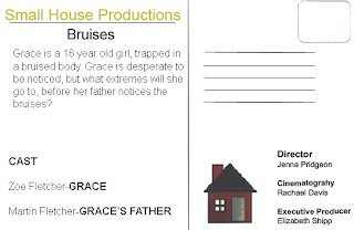
Shot on a Sony PD150 in and around the charming village of Kings Langley, Jenna Pridgeon , the director of the film, works alongside her cinematography colleague Rachael Davis, and her cast of aspiring actors to be, to create the latest short film debut ‘Bruises’.
‘Grace’, played by 17 year old Zoe Fletcher, is an innocent, frightened adolescent, desperate for her bruises to be noticed. Her unidentifiable father, Martin Pridgeon (Pridgeon’s real life father), gives Grace an unexpected present of make-up, to cover up the distressing evidence. Or not.
Pridgeon creates an unpredictable twist to the story. The audience is left questioning whether Grace is being abused by her father or if she is inflicting the bruises on herself, with help from her make-up set, and clever shots suggesting drug use.
As Pridgeon’s film is a short, we are propelled into the mind of Grace at the quickest of paces, darting between fear-happiness-love-depression and her extended creativity. But where other shorts typically fail in keeping the audience conversant with the rapid changes, Pridgeon successfully balances each mood and feeling, with help from blue gels, forcing a cold emotion in Grace’s home, creating the oddest of comforts in the distressing situation that is Grace’s life. With its dark implications, distinctive camera shots and musical interludes, ‘Bruises’ feels much indebted to a Mike Leigh masterpiece.
However, due to such quick paced action, and time limit’s, there are noticeable continuity problems that are evident in the film, including Grace holding a make-up brush in her right hand in one shot, and the brush laying on the bed in the next. Not only this, due to low-budgets and limited editing software such as Adobe Premiere Pro, the scene where Grace immerses into a world of her own, the obvious slow motion effect can seem on the verge of ‘cheesy’. However, with the resources Davis and Pridgeon had, they prevent this scene from being an unmitigated disaster, with clever acting directions, snapping Grace back into reality.
Unique camerawork and lighting from Rachael Davis, such as low tracking shots and the intimidating shadows of the father on Grace’s painfully bare walls, dangerously immerses you into a terrifying reality. Nevertheless, it is the denouement which really shows Pridgeon’s and Davis’ collaborative efforts.
It is consequently up to the audience to make the inevitable decision they are left with in the end. This use of narrative closure forces the audience to question
This in itself is a unique style that Pridgeon has adopted from some of her most admirable influences of ‘Donnie Darko’ and ‘The Blair Witch Project’.
Exceptional as a first time short film-maker Pridgeon may appear, ‘Bruises’ borders on the cliché, with our main character being fully engaged in the arts, expressing her clearly immaculate creative skills, in colouring a grape. Pridgeon’s suggestion of art acting as a form of escapism for Grace isn’t explored nearly as much as it should have been. However, Pridgeon allows the audience to digress with the ending, exploring Grace’s attachment to her art and make-up sets in the fatal conclusion.
A great start for a promising new director, ‘Bruises’ is worth a watch.

 This is an example of a new American Hollywood film release, called


